Savings. Right here.
Redeconomia Rebranding, 2025.
Redeconomia had “savings” in its name. But didn’t own it.
In a category defined by price and loyalty, the brand needed a clear strategic advantage to stand out as the best choice. At the same time, the audience was changing. Younger and more diverse consumers were emerging, but the brand’s message was too forgettable and increasingly disconnected from them. So we turned that into something the brand could finally own:
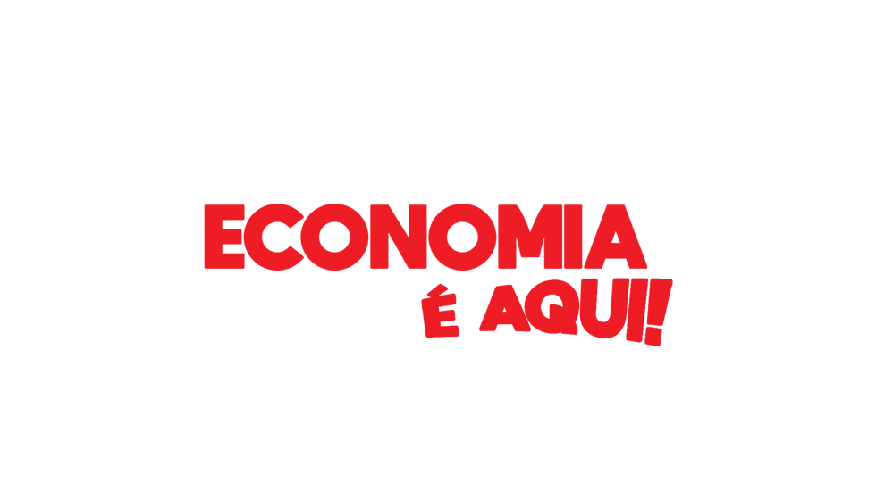
Economia é aqui!
(Savings. Right here)
A clear, distinctive and easy to understand idea that moved Redeconomia from a price-driven player to a brand built around real, everyday value. Not just cheaper but smarter, closer, more relevant. The brand became a system with a consistent presence across every touchpoint, making the idea visible, repeatable and impossible to ignore.
A new mark for a clearer idea.
The visual identity was modernised — moving to a flat version, more versatile and legible. A reduced version reclaimed the brand’s historic coin icon — turning the overlapping “E” and coins into a distinctive, ownable symbol of economy.


A positioning designed to stick.
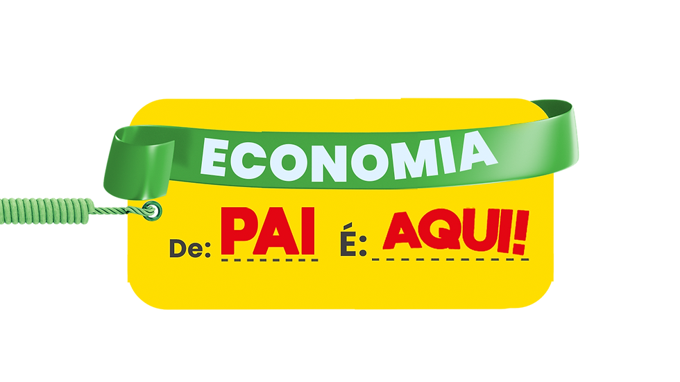
“Economia é aqui!” ("Savings. Right here.") became the brand’s central expression — brought to life through a set of living brand elements.


A visual language designed to follow the rhythm of speech, which makes the message feel heard even through graphics.
A confident voice, with deliberate pauses to reinforce the brand positioning.
A repeatable gesture used consistently to build recognition.
Content as behaviour.
Economy became an attitude — expressed through useful tips, accessible recipes and everyday hacks, while reinforcing local pride and community identity.


Launch as narrative.
Launching campaigns were designed as chapters of the same story — each one reinforcing “Savings. Right here.” through popular, emotional and highly recognisable executions.


Redeconomia didn’t just update its brand. It turned “savings” from a generic promise into a distinctive brand asset.
+26M
71.3%
views across launch campaigns
viewability
+53.3%
CTR vs category benchmark
+22.3%
VTR vs category benchmark
Strong audience shift: male audience grew from 29% to 48%, with consistent growth among younger consumers
Communication unified across 140+ stores and local teams
Winner — Prêmio Marketing Contemporâneo (ABMN), Branded Content & Storytelling
Credits: Creative Direction, Brand Strategy & Copywriting — Sarah Rolindo / Art Direction — Sarah Rolindo / Design — Rachel Freitas / Production — Hebert Quiles, Ulysses Sena, João Paulo